
tutorials :: Funktionen plotten
| Inhalt |
|---|
 ist ein Textsatzprogramm, und kein mathematisches Softwarepaket.
Dennoch gibt es Momente, in denen man sich wünscht, dass auch ein bisschen mathematischer sein könnte.
Obwohl das und
ist ein Textsatzprogramm, und kein mathematisches Softwarepaket.
Dennoch gibt es Momente, in denen man sich wünscht, dass auch ein bisschen mathematischer sein könnte.
Obwohl das und
Gnuplot
ist in der Lage, außenstehende Programme anzusprechen.
So ist TikZ in der Lage, mit erlauben, mit anderen Programmen zu kommunizieren, und zum anderen
pdflatex --shell-escape [dateiname].tex
Daraufhin werden im aktuellen Arbeitsverzeichnis neue Dateien erstellt.
Darunter befindet sich eine Ein Beispiel
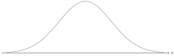
Wie wäre es mit einer Gaußschen-Glockenkurve? Kein Problem.
\begin {tikzpicture}[scale=2, y=5cm]\draw [->, semithick] (-3.2,0) -- (3.2,0) node[right] {$x$};\draw [domain=-3:3] plot[id=gauss0, samples=50] function{1/sqrt(2*pi)*exp(-0.5*x**2)};\end {tikzpicture}
|
Damit man die Glockenkurve überhaupt erkennen kann, vergrößere ich zu Anfang die Grafik mit dem
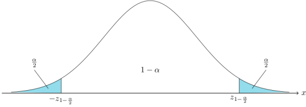
Das gleiche Beispiel etwas anders:
\definecolor {myblue}{HTML}{92dcec}\begin {tikzpicture}[scale=2, y=5cm]\draw [domain=-3:-1.92, fill=myblue] plot[id=gauss1, samples=50] function{1/sqrt(2*pi)*exp(-0.5*x**2)} -- (-1.92,0) node[below] {$-z_{1-\frac{\alpha}{2}}$};\draw (-2.2, 0.1) -- (-2.5,0.5) node[above] {$\frac{\alpha}{2}$};\draw [domain=-1.92:1.92] plot[color=red, id=gauss2, samples=50] function{1/sqrt(2*pi)*exp(-0.5*x**2)};\node at (0,0.5) {$1 - \alpha$};\draw [domain=1.92:3, fill=myblue] node[below] at (1.92,0) {$z_{1-\frac{\alpha}{2}}$} (1.92,0) -- plot[id=gauss3, samples=50] function{1/sqrt(2*pi)*exp(-0.5*x**2)};\draw (2.2, 0.1) -- (2.5,0.5) node[above] {$\frac{\alpha}{2}$};\draw [->, semithick] (-3.2,0) -- (3.2,0) node[right] {$x$};\end {tikzpicture}
|
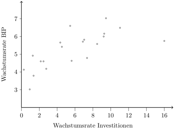
Noch ein Beispiel
In diesem Beispiel will ich zeigen, dass man auch Scatterolots erstellen kann. Als Daten betrachten wir die Wachstumsrate der Investitionen und des gesellschaftlichen Gesamtproduktes der DDR in den Jahren 1961 bis 1980, welche ich aus dem statistischen Jahrbuch der DDR von 1984 errechnet habe. Die Daten sind in der Datei scatterplot.table enthalten. Beeindruckende Wachstumsraten, da versteht man garnicht, warum das nicht hingehauen hat.
Zurück zum Thema.
Hier nun der Scatterplot.
Dabei muss die pgflibrary
\begin {tikzpicture}[x=.5cm]\draw [->, thick, yshift=2cm] (0,2) -- (17,2);\draw [->, thick, yshift=2cm] (0,2) -- (0,8);\foreach \x in {0,2,...,16}\draw [yshift=2cm] (\x,2) -- (\x,1.8) node[below] {\x};\foreach \y in {3,...,7}\draw [yshift=2cm] (0,\y) -- (-0.2,\y) node[left] {\y};\node [yshift=2cm] at (8, 1) {Wachstumsrate Investitionen};\node [rotate=90, yshift=2cm] at (2, 7) {Wachstumsrate BIP};\draw plot[only marks, mark=o, mark options={scale=.5}, yshift=2cm] file {scatterplot.table};\end {tikzpicture}
|
Das größte Problem stellt eine geeignete Skalierung der Achsen dar.
Gleich zu Anfang wird die x-Achse mit
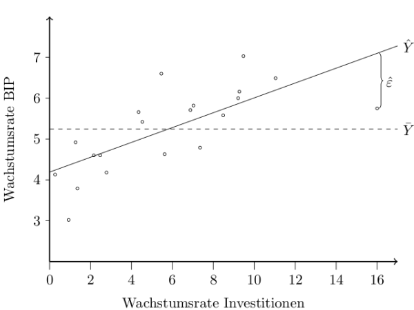
Wenn man will, kann man das ganze natürlich ergänzen.
Z.B. mit einer Regressionsgeraden.
Hierbei muss zusätzlich
\begin {tikzpicture}[x=.5cm]\draw [->, thick, yshift=2cm] (0,2) -- (17,2);\draw [->, thick, yshift=2cm] (0,2) -- (0,8);\foreach \x in {0,2,...,16}\draw [yshift=2cm] (\x,2) -- (\x,1.8) node[below] {\x};\foreach \y in {3,...,7}\draw [yshift=2cm] (0,\y) -- (-0.2,\y) node[left] {\y};\node [yshift=2cm] at (8, 1) {Wachstumsrate Investitionen};\node [rotate=90, yshift=2cm] at (2, 7) {Wachstumsrate BIP};\draw plot[only marks, mark=o, mark options={scale=.5}, yshift=2cm] file {scatterplot.table};\draw [domain=0:17, yshift=2cm] plot[id=regression, samples=2] function{0.18177*x+4.19037} node[right] {$\hat{Y}$};\draw [yshift=2cm, dashed] (0, 5.244) -- (17, 5.244) node[right] {$\bar{Y}$};\draw [snake=brace, yshift=2cm] (16.1, 7.1) -- (16.1, 5.75) node at (16.6, 6.4) {$\hat{\varepsilon}$};\end {tikzpicture}
|